Tuesday, June 26, 2012

Dolphin 2.1


Dolphin 2.1 will be released as part of KDE applications 4.9 on the first of August and to me this is a very special release: After 6 years of development, around 2700 commits and a lot of fun I'll be forwarding the maintainership to Frank Reininghaus. Frank did a great job during the last years to improve Dolphin and I'm really glad that he accepted the maintainership.

For me forwarding the maintainership also means that I won't provide any bugfixes or features for Dolphin anymore. Probably this step is quite surprising for most readers and I think I owe an explanation. Before going into details it might be useful to first describe the reasons for developing Dolphin at all.

The first steps

At the beginning of 2006 I wanted to gain some experience with Qt and I've been looking for a small project. I liked the functionality of Konqueror but was not happy with the user interface - I thought that writing a small and fast file manager fitting just for my own needs and to learn Qt should not be that hard (if somebody would have told me that I'll be spending at least 6 years on this project I probably would have given up immediately). Thanks to some great classes in kdelibs I was able to browse through directories only a few hours later and my (wrong) assumption "this should not be that hard" got tightened.

Around mid of 2006 I've released the 0.5 version of Dolphin at kde-apps.org. Making a long story short: Matthias Ettrich called me and asked whether I want to help contributing to the filemanager for KDE 4.0. David Faure was very busy with porting parts of kdelibs to that time and more interested in doing the tricky and challenging parts instead of the "boring user interface programming" (I cannot remember anymore the exact words Matthias has used, but it was something like this). Well, suddenly I was part of the KDE community, got great support from Aaron J. Seigo and it started to get a great experience for me to contribute to such a large project. Learning Qt was secondary then, it was more about learning how the whole development for such a big project works and how decisions are made.

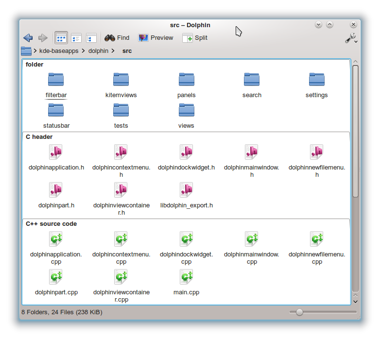
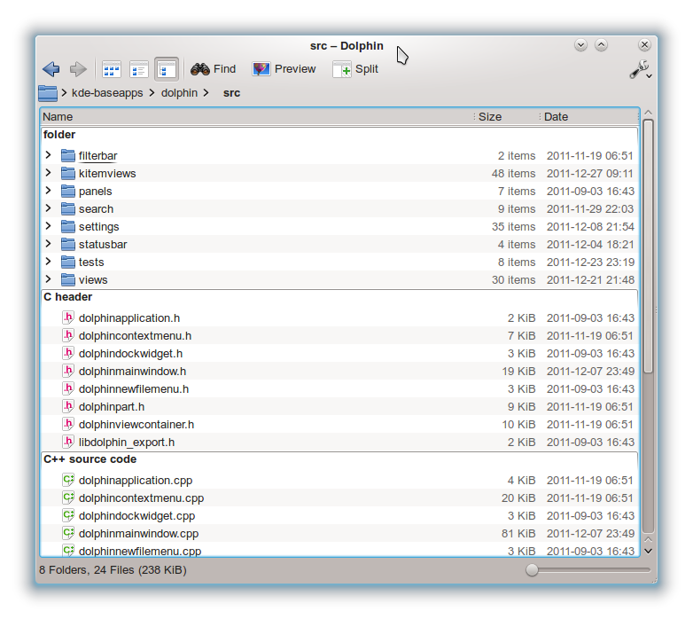
It is quite interesting to compare a screenshot from Dolphin 6 years ago to the recent version:


What has changed since then?

The KDE community is still great and there are enough things left to make Dolphin better, so what has changed since then for me?

One thing is that the time required to keep Dolphin in good shape increased during the last years. I'm doing this project in my spare-time and usually have spend around one evening per week on Dolphin. Especially during the last 2 years this time has increased. In the longterm especially the (for me absolutely necessary) step to port Dolphin to QtQuick2 is something I won't be able to do within a sane timeframe. The interesting thing is that porting the new view-engine to QtQuick2 is probably the easiest part: There is a clean seperation of the representation and the model and exchanging the representation should be doable within a reasonable amount of time. I guess with Qt 5.1 or 5.2 (I don't know) there will be desktop-components for QtQuick2 and porting Dolphin to this components will be a very timeconsuming and boring task: All the settings-pages, the URL-navigator, the information-panel, the search-interface, the tooltips, ... - this is just not doable anymore in my spare-time.

Of course you might ask whether a port to QtQuick2 is really necessary. But to me in the scope of KDE QtQuick2 is the only solution to be able to compete with the other big desktop environments out there in terms of a responsive and beautiful interface.

So would it help if other developers would join the Dolphin project and take care for doing the QtQuick2 port? Sadly for me this still would not be enough to keep on maintaining Dolphin, as there is another reason to quit contributing: I'm using KDE since version 1.2 and I never cared what market share KDE or Linux on the desktop has. However to me it was important that the desktop-environment I'm using and spending time for can compete with the desktops-environments from Microsoft and Apple. As user I always had the impression that I can do my regular tasks like reading e-mails, browsing, managing my photo- and music-collection, rarely writing a document, maintaining my contacts, adding calendar-entries... in a more efficient and comfortable way than on the other desktop-environments.

But at least for my regular tasks as user this has changed during the last couple of years. It is tricky to give examples without pointing fingers to parts of KDE where I think we are not competitive anymore, so I won't do this.

I don't have a good explanation why this gap has increased during the last years (at least from my perspective). One guess I have is that the kind of complexity of applications has changed during the last years:
  • The user interfaces tend to become simpler and easier to the eye, while the functionality of the application itself has increased. Hiding a complex functionality behind an easy to use interface are not known strengths of "typical" developers ;-)
  • The complexity of the non-user-interface-parts of applications has increased a lot. Web-browsers are a good example: While the interface got simplified during the last years, the engines showing web-pages got really complex and are maintained mostly by fulltime-developers in the meantime. There seems to be a similar trend in PIM-applications ("cloud"), chat-clients (one simple user-interface, a various number of protocols) and for desktop-search-engines (simple user-interface, really complex stuff going on behind the scenes).

Working on the non-user-interface parts of applications can be challenging and this is not something that most freetime-contributors are striving for. But if there are not enough contributors for the complex stuff behind the scenes and if no company is willing to invest fulltime-developers to work on this... - well then we are losing ground. And even if Gnome seems to get more support from companies, I don't see a big difference to KDE here.

Probably my explanation/guess/theory is nonsense and utterly wrong. But this does not change my point of view that at least for my tasks I can work in a more efficient and comfortable way on other desktop environments in the meantime. And this aspect makes it hard to keep up the motivation for investigating a lot of spare-time into KDE.

I hope this does not sound like a blog-entry from a "frustrated developer" - this is not the case :-) I'm leaving the project at a stage where I still liked to contribute and where I enjoyed being part of KDE. I wish KDE all the best for the future and I'm proud that I got the chance during the last years being part of this community!

Sunday, June 3, 2012

Improved Views

Until now Dolphin could display metadata like rating, tags, comments, image-sizes, album-name, ... only inside tooltips and the information panel:


With the release of Dolphin 2.1 (as part of KDE applications 4.9) this kind of information can now also be shown inside the views. I'll just let some screenshots speak for themselves:


Thursday, April 12, 2012

Plasma Active and Maliit


Openismus gave me the opportunity to check how good or bad Maliit works together with Plasma Active. As I've never installed Maliit nor Plasma Active until now I expected some pitfalls, but in the end I got both of them running on a WeTab tablet:


Most Planet KDE readers are of course familiar with Plasma Active, but what is Maliit?

Maliit


Maliit provides a cross-platform input method framework for mobile text input including a virtual keyboard. Maliit is the input methods solution used in Nokia's N9 MeeGo phone:


Providing a virtual keyboard seems to be straight forward in the first sight, but it is very challenging if things like predictive input, error-correction, cut/copy/paste, multitouch, context-sensitivity or languages like Chinese and Arabic should be supported.

Current State


The combination of Plasma Active and Maliit works together better than I expected initially: Focusing an input field automatically pops up the Maliit keyboard and entering a key results in showing the output without delay on the WeTab tablet. This sounds self-evident, but the performance is very critical for a virtual keyboard: Even a minor delay after touching the device gets noticed by users - the acceptable delay seems to be a lot lower than the usual "keep it below 300 ms and it will be perceived as fast" user interface objective.

At the moment there are at least two open issues that need to get fixed in Maliit:
  • When entering a key the 'key magnifiers' (= the orange 't' in the first screenshot) don't disappear. The issue is tracked on the Maliit bug tracker and investigations are ongoing.
  • Currently Maliit requires compositing for providing the virtual keyboard as overlay.

Installation


I've installed Plasma Active and Maliit from the sources on the master-branch to be sure being on track with the latest state of both frameworks. For Plasma Active the installation guide and the development guide are sufficient for building Plasma Active. I've added a few notes to the Maliit on Plasma wiki to document the approach I've taken.

Installing Maliit is straight forward. On the first screenshot above word prediction is enabled. For this Presage is required, one pending merge-request must be used and qmake must be called with CONFIG+=enable-presage

The progress of integrating Maliit into Plasma Active is tracked at https://bugs.maliit.org/show_bug.cgi?id=51 - I cannot judge the final outcome of this, but I think from a technical point of view it is a benefit for both frameworks if they are interacting well. Whether Maliit might be a candidate for being the default input method for Plasma Active also involves some non-technical topics like the general maintenance of Maliit and whether there are enough resources to make the integration with Plasma Active really perfect. We'll see :-)


Sunday, March 4, 2012

Taking Care for Details


Frank Reininghaus already wrote about all the 4.8.1 Dolphin-bugfixes we've done, so I'd like to talk about just one specific fix: It is "only" about some visual improvements regarding the layout of items when turning on the grouping-feature, but the interesting thing is what happened behind the scenes.

It started when Martin Zilz from kreativkonzentrat wrote me an e-mail a few weeks ago with some suggestions how to improve the look of group-headers. The base of discussion was the following state:


Beside the group-headers Martin also recognized other issues with the layout and it required several internal adjustments in the view-engine to achieve what Martin suggested. But after sharing a lot of e-mails with updated screenshots and doing some finetuning in the code I'm really happy with the end-result:


But beside the icons-view we also adjusted the group-header for the other views. Before the changes the compact view looked like this:


After following Martin's suggestions it looks like this:


The details-view is something where I'm still not 100 % happy, as the alternate backgrounds don't work well together with the grouping from my point of view. However I'd say the look still has improved from:


to:


The main reason why I've written a blog-entry about this bugfix is that it should be an example of how an application can get improved when working together with skilled designers. As developer it is tricky to think outside the boundaries of your own implementation. E.g. I never thought about the vertical lines in the compact-view as the height of the group-header widget was only around 20 pixels. Martin was able to think outside those boundaries and in the end it was not tricky to implement. I had similar experiences when working together with Nuno and Hugo from the Oxygen team. Although many users probably won't see the difference in the first sight I believe those details matter to have a comfortable user experience.

Tuesday, January 3, 2012

Dolphin 2.0 - Status Update


Grouping Support

When introducing Dolphin 2.0 I talked about  grouping support for all view modes. But I could not offer any screenshots, as this feature was not ready yet at that time. So here we go showing the same folder grouped by the file type in the icons-mode (which is already available since Dolphin 1.2):


... in the compact-mode:


... and in the details-mode:


I think there is a lot of room for visual improvements of the group-headers especially in the combination with the details-mode. However this is something that needs to be discussed with our Oxygen-gurus Nuno and Hugo and will hopefully be improved in the next version.

Still I'm quite happy with the new implementation. It fixes performance issues that occured with the previous implementation, fixes keyboard-navigation issues and provides a solid base for future extensions like grouping by rating, tags, comments or any arbitrary grouping-category.

General Status

The rewrite of the Dolphin view-engine was a lot of work and resulted in changing of much code. The benefits are an improved performance, getting rid of a lot of bugs that could not be solved with the old view-engine and a better maintainable code-base. But it would be illusionary to expect that there will be only benefits and zero regressions: Dolphin 2.0 will be a typical "dot zero" release where minor issues will popup after the release. However based on the current feedback on bugs.kde.org there seem to be no showstopper bugs left. The currently known regressions and missing Dolphin 1.x features can be seen on the Dolphin 2.0 Status page and I'm confident that during the 4.8.x release cycle most regressions can be fixed.

Outlook for Dolphin 2.1

As the development-focus will be to fix the regressions and making the fixes available for the 4.8.x cycles, there is not much room for big features in Dolphin 2.1. But there is one feature that I miss since Dolphin 1.0 and that could not be implemented with the old view-engine: The showing of any arbitrary meta-data of a file in the views. The tooltips and the information panel already can show things like rating, tags, album-name, image-size and a lot more:


Now in Dolphin 2.1 it will be possible to show all this kind of meta-data as part of a file or directory in all view-modes (this also includes sorting and grouping). The view-engine internally already supports this but I could not finalize the user interface for the 2.0 version.

This makes it e.g. possible to configure a kind of "Music view" where for each song the artist, album-name and the rating is shown. Another usecase might be images, where showing the image-width and -height as part of each image might be useful.

Finally I'd like to say thanks especially to Frank Reininghaus, who helped a lot to get the new view-engine in shape. Frank told me he probably wants to give some development-updates on Planet KDE in future, but I think I need to create some public pressure by mentioning this here to make it happen ;-)

Monday, August 1, 2011

Introducing Dolphin 2.0

During the last months I've been working on Dolphin 2.0 which is planned to get released with the 4.8 release of KDE Applications. Dolphin 2.0 will get a new "view-engine" that will have several improvements in comparison to the current version.

Well, what means "view-engine" in the scope of Dolphin? The view-engine is responsible for showing the directory content as icons and text. In a very simplified form it can be seen as the sum of Dolphin's "icons mode", "details mode" and "columns mode".

The current version 1.7 of Dolphin is based on Qt's Interview Framework. Regarding the quality of the Interview Framework I'd like to quote a Qt developer from the Qt Labs Itemviews - The Next Generation  article:
"Not surprising. If you are using Qt, chances are you are using the item views. And if you are using the item views, you are likely to have an opinion about them. While using these classes you may have even form the opinion that they are not exactly the most shining example of Qt quality framework and API design. Let’s just say that there is room for improvement, lots of room! The symptoms are clear: the framework is generally too slow, unstable and the API is difficult to use. A clear case of overly complex design."
Having worked with the Interview Framework during the last four years I fully agree to this (... and probably would not have phrased it as friendly as in this quote ;-)). As an alternative for the Interview Framework a research project called Itemviews-NG has been created. After comparing Itemviews-NG with the view-engines-related code from libmeegotouch and Qt-Components it was clear that currently for Dolphin the Itemviews-NG would be the best choice. So the new view-engine for Dolphin 2.0 is build on a (very) modified subset of Itemviews-NG. In the longterm (probably with Qt 5) it is planned to integrate Qt-Quick but this affects only a non-critical minor part of the view-engine and has not high priority at the moment.

So much talk about the new base of the view-engine, but which benefits get the users of Dolphin by this?

Improved Performance

The new view-engine has been tested on a computer with a very slow hard-disk and developed with corner-cases in mind where the current view-engine had serious performance troubles. Now switching view-modes, zooming, resizing, ... is done with nearly no delay no matter how many items a directory has.

Unclipped Filenames

With Qt's Interview Framework having dynamic item-heights the way Dolphin required it was not possible. As workaround Dolphin used a fixed grid-size where the user could configure the maximum number of textlines. No matter which value has been used: Either the item-height got too large or the text got clipped like this:


Like most other filemanagers now also Dolphin is able to have dynamic item-sizes:


As a side-effect Dolphin 2.0 wastes less space and can show more items in parallel when using the same icon-size as the current Dolphin version.

Nonrectangular Item Boundaries

The Interview Framework only supports rectangular item boundaries. This means that moving the mouse above the position marked as red spot...


... results already in hovering the whole item:


The new view-engine provides optimized non-rectangular item boundaries:


So the hovering only takes place when the mouse pointer is above the the icon or text like in KDE 3 (Note that the look of the hovering is just a prototype and might change)

Grouping Support For All View Modes

Currently the "grouping" feature is only supported for the icons mode but will be available for all view-modes in Dolphin 2.0. I could not provide a screenshot yet as the code for grouping is still in a very early alpha-stage. In opposite to the current version of Dolphin grouping will not slow down the performance at all.

Animated Transitions

At the moment when removing or inserting items, changing the zoom-level or resizing the window the item-positions change magically from the original position to the new position. This sometimes makes it tricky for users to follow the new location of the items. With Dolphin 2.0 the layout-engine is fast enough to make those transitions animated. I don't like animations that slow-down the usage of an application so I took care to make them fast and unobtrusive.

From a developers point of view the new engine simplifies the maintenance a lot and lowers the barrier for developers to contribute patches for Dolphin. The code has been pushed to master today. Please note that the code is in an early alpha-stage and although the most tricky parts have been implemented already very basic things like drag and drop or selections have not been pushed yet. Those things are rather trivial to implement but it is still a lot of work and takes some time to have back the original feature-set. But I'm confident that everything will be ready until the 4.8 release of KDE Applications and hope that the new view-engine will justify the 2.0 version number :-)

Sunday, March 27, 2011

Menu Bars

The menu bar has always been a kind of "holy grail" of user interface elements for me. It contains all application commands and allows the user to discover the application capabilies and to learn the keyboard shortcuts. Often used commands are placed into the toolbar for faster access.

I did no scientific research about this, but I think first it was Microsoft with Windows Vista which started to put the menu bar into question for some applications:

  • The ribbon replaced the traditional menu bar for their office suite.
  • The menu bar is hidden per default in the Internet Explorer and the Windows Explorer. To still be able accessing all commands a kind of menu-button has been added to the toolbar.


Until I tried those applications I've been a strong opponent of those "menu bar violations". But after working a while with both approaches it seems that ribbons work very well for applications with a huge number of commands. I'm not sure whether the Internet Explorer or Google Chrome has been the first browser without menu bar, but as user of Chrome since around two years I was surprised that I never missed the menu bar and liked the well-arranged menu button.

I got the impression that the menu button as replacement works well for applications with quite less commands. In the meantime even Firefox 4 has switched to a default setup where no menu bar is shown; so I asked myself whether this might be an option for Dolphin and simply gave it a try. Since the release of Dolphin with 4.5 I try to strive for a cleaner and less cluttered default setup and now with having no menu bar I think the default setup is quite OK [1]:


It gets move obvious when comparing this with the default setup in 4.5:


Before the complaints "I want my menu bar back" start: Of course it is possible to enable the traditional menu bar :-)

Back to the new default setup of Dolphin. Beside the missing menu bar a lot of smaller updates have been done too:

  • The Information Panel on the right is hidden.
  • Toolbar items where the icon is sufficient for knowing the command don't have a text. By the way: In 4.7 this can be changed by a simple right-click.
  • If the Places Panel is shown (like in both screenshots on the left) the "places selector" left from the Home > Pictures > Wallpapers path is hidden as it is duplicated functionality provided by the Places Panel.
  • The Panels are "locked" per default like in Amarok and don't have a headline and two buttons.
  • The search bar at the top right has been integrated into the view when executing the "Find" command.


Please note that those points just talk about default settings, no functionality has been taken away. For me it was - and still is - one of the main goals of Dolphin that it is easy and efficient to use without cutting too many features. I somehow like it that despite the added functionality during the last years this is not reflected in additional visual clutter. When looking back at the history of Dolphin screenshots it is somehow funny that for the upcoming 4.7 release Dolphin looks more similar to the old KDE 3 version than the 4.5 version :-)

[1] Please ignore the current look of the zoom-icons in the bottom-right of the screenshot. They will be replaced by a more decent version created by Nuno before 4.7.